Unscrolled Teacher Dashboard

Overview
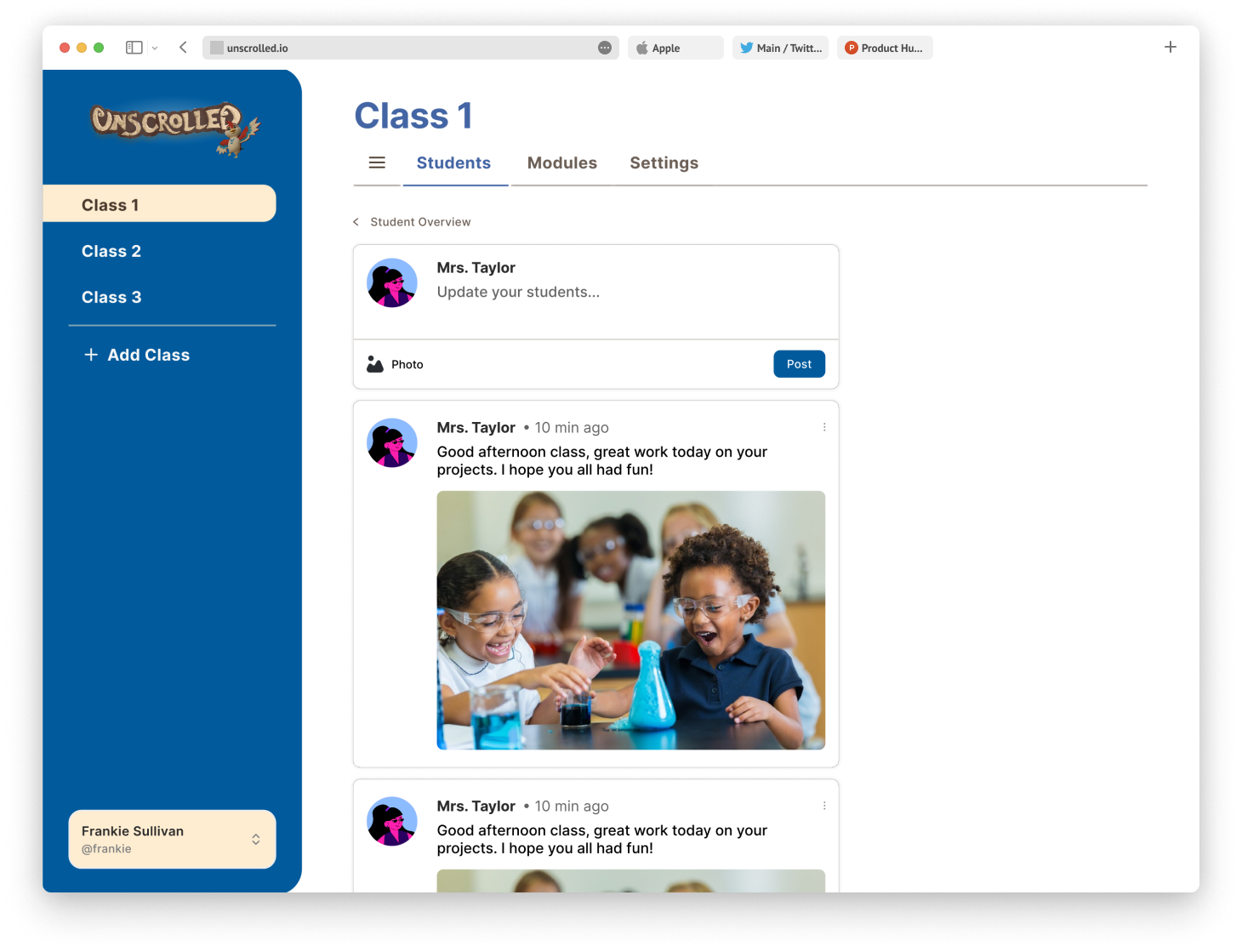
Unscrolled is a school-affiliated, adventure game. Teachers can create learning modules for the game and track student progress through a dashboard.
For this design sprint, I lead 4 designers in creating the student overview page for the teacher’s dashboard. Together we identified a problem statement, ideated a solution, and created high fidelity mock ups. I also worked directly with our software developers to implement the design onto our website.
Role
Lead UX Designer
Timeline
July - September
(13 weeks)
Tools
Figma
Figjam
Problem Statement
Teachers need a responsive dashboard to monitor student learning progress for Unscrolled.
User Personas
Simple interfaces are important
By putting ourselves in the teachers’ shoes, we realized a teacher’s busy schedule necessitated simple interfaces that allowed them to easily navigate a website and complete tasks in fewer steps.

Competitive Analysis
Rewarding positive behavior
Many existing solutions prioritized using a point system to reward positive behavior. This often took precedence over monitoring learning progress. We liked the point system, but we wanted Unscrolled’s dashboard to both reward positive behavior and monitor learning progress seamlessly. Our initial solution was to have a simple overview page allowing teachers to manage the points students earned for positive behavior. We would also include a results page to monitor student learning progress.


Iteration
Simplifying the complex
In order to accommodate monitoring individual student progress and overall class progress, our original user flow required a drop down menu for the results tab in the navigation bar. Incorporating a drop down menu when we already planned to have a vertical and horizontal navigation bar overcomplicated our solution. To address this, we simplified the user flow by combining our overview page with our student results page. This eliminated the need for the drop down menu without sacrificing any features.
Before:


After:


Iteration
Expanding our design system
The teacher’s dashboard required a much different aesthetic than the children’s game. We decided to incorporate a more modern typeface, inter. Rather than the teal we used for the game, we also used a darker blue for our primary color. To keep the designs across both the game and the website cohesive, the primary color was color picked from the game’s art assets. We also used the same secondary and neutral colors.


Iteration
Adding information cards
We considered a feature that would allow teachers to tag federal and state learning standards to the learning modules. This would allow for a more robust student progress monitoring. However, the development team stressed the difficulty of implementing such a feature for the MVP. As an alternative, we decided to utilize information cards at the top of the teacher’s dashboard. This would allow teachers to see how many students were behind based on module completion and overall grade.

User Testing
Adding a few more features
User testing was generally positive. 4 out of 4 teachers said that the information cards and the points system would be extremely useful.
2 out of 4 teachers wanted a way to communicate with students. However, the development team stressed that adding a messaging board was too complex for the MVP. Instead we allowed teachers to view and copy student and parent emails. Moreover, we implemented af eature that would send announcements to the game.
Another teacher wanted a quick way to take attendance. In consideration of the dev team, we added a an attendance feature without adding attendance records. this feature would allow teacher to take attendance for the way and also assign points to every student present based on overall good class behavior.

Final Design
Metrics for Success Would Include:
Tree Testing Results could show the learnability of the user interface, specifically whether our changes to the user flow made the navigation simple enough to easily understand.
Time to Complete Action would also reflect how easy it is for teachers to navigate the dashboard.
Future iterations could include
A calendar and notification system so teachers know when to check results for upcoming assignments.
What Did I Learn?
Working with developers introduces design constraints I would not have in a hypothetical project case. Therefore meeting design goals and business goals requires increased creativity and collaboration.
Additional Screens