Eats
Overview
Whether I cook it myself or go out to a restaurant with friends, trying new food is always something I enjoy! I wished there was an engaging platform specifically for food related content that wasn’t your average recipe finder and grocery list combo. That’s how this project came to be!
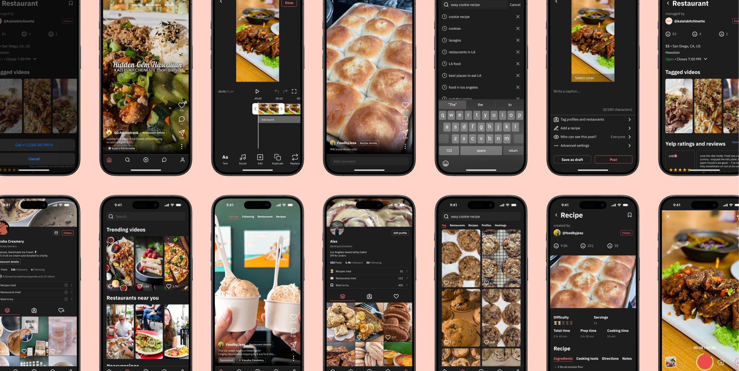
Eats is your all-in-one social media platform for food related content. On Eats, you can easily find and share detailed info for recipes and restaurants.
This conceptual app was a solo project for which I identified the problem, conducted research, developed a solution, ran user testing, and completed all product design artifacts from sketches to prototypes.
Timeline
Jan 2024 - Mar 2024
(7 weeks)
Role
Product designer
Tools
Figma
Figjam
Problem
Foodies & home chefs find it frustrating to share recipes & restaurants without having their social media feeds overtaken by food.
Whiteboard exercise
Define project scope & sketch ideas
By framing the problem in terms of a whiteboard exercise for a fictional company, I was able to narrow down the scope of the project to identify the hypothetical business goal and project scope:
Create an mvp for an unfunded startup to attract investors.
I also briefly explored user personas, analyzed current solutions, developed a few simple flows, and conducted a crazy 8 sketching exercise.


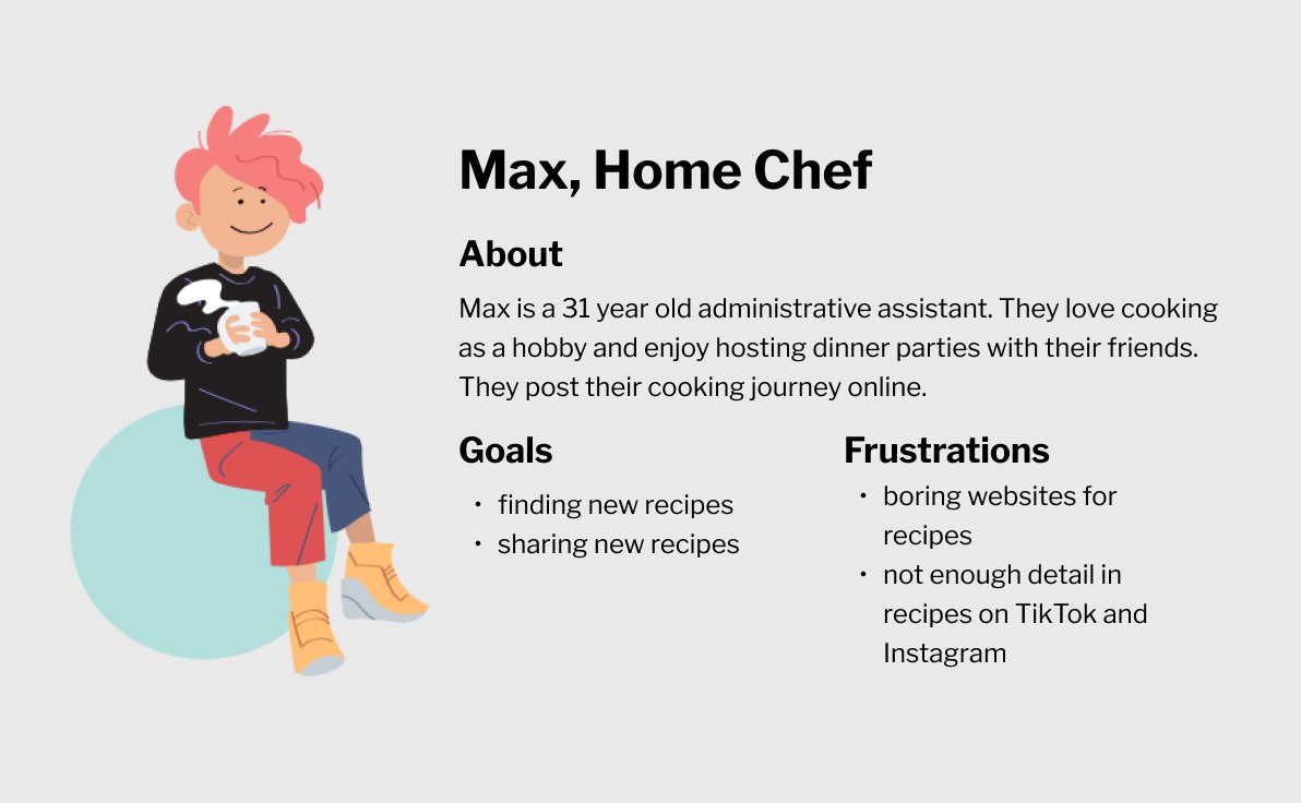
User personas
2 primary users: foodies & home chefs
Expanding on the whiteboard exercise, I identified the target audience and further explored their pain points and goals.

Competitive analysis
No comprehensive food app available
In addition to expanding on my whiteboard exercise by fleshing out the user personas, I also conducted a competitive analysis. These exercises helped me gain enough context to brainstorm features for my design solution. Through this exercise, I quickly realized users would need multiple apps to accomplish their goals.

Impact effort matrix
Info cards are a key feature
With the personas and competitive analysis in mind, I brainstormed potential features. Then, I prioritized them via an impact-effort matrix. I decided to keep all the feature from the blue and green sections as well as the recipe and restaurant detail cards from the yellow section.

User flow
Mapping out user behaviors
Using the previous insights, I developed the user flow for the platform. For this project, I specifically wanted to focus on creating the key frames for browsing the feed, searching for content, and creating new content.

Wireframes
Translating the solution to wireframes
I created wireframes on Figma, using my whiteboard exercise sketches and user flow as guides.

User research
Survey validates & improves solution
I created a survey with 5 open ended questions and received responses from 21 people. I translated some of the qualitative data into quantitative data to better analyze the results. Then, I used my learnings to continue improving my wireframe iterations.
1. 86% of people who consume food related content prefer to look at restaurants & recipes.
Why this is important:
The solution to have a platform for detailed recipes and restaurant information is validated because recipes and restaurant content make up a majority of the food related views.

2. 55% of people have tried recipes they’ve found on social media.
Why this is important:
Of the 45% who haven’t tried a recipe, most had reasons that would be solved by our platform. For example, people cited that the content “tend[s] not to include detailed recipes” and is “just for views and not for practicality.” This validates the untapped potential market of the solution.

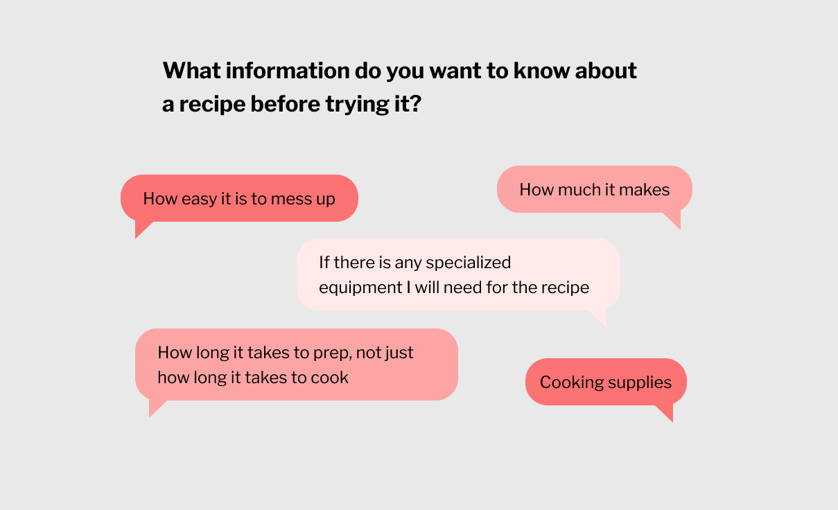
3. People had a lot of feedback on what information they wanted to see on a recipe card.
Why this is important:
Using this feedback, I added more information to the wireframes, including prep time, servings amount, and what kind of cooking tools.


Usability testing
Usability testing leads to new features
2. Recipe tagging

People wanted a way to tag another user’s recipe when posting new content. To address this, I added a save feature on the recipe cards and allowed people to tag recipes from their saved content.

1. Differentiated profile


People were disappointed as to what about the profile made it unique to a social platform for food-related content. I added a way to display each user’s ratings of different restaurants and recipes, as well as direct link to each restaurant’s details card.
3. Internal rating system

Although I highlighted writing reviews in the user flow of my white boarding exercise, I originally decided to just insert yelp reviews for an MVP product. People liked seeing the yelp reviews, but they still wanted a metric that was unique to the app. Therefore, I brainstormed rating methods that could be used for both recipes and restaurants. Star reviews and thumbs ups/downs are already overused, so I decided to try an emoticon based rating.

Design solution
All-in-one social media platform for food related content
Engaging photo and video food content
You no longer have to filter through dozens of boring recipe websites.

Useful recipe and restaurant details
There’s no need to visit external links or google restaurants. All the info you need is now in one place.

Quick and easy content creation
There’s no need to use another app to edit your photos and videos.

How would this succeed as a business?
Ad revenue would be the main factor in generating profit, including a paid model to allow small businesses and creators to promote their content.
Metrics for success would include:
Net Promoter Score to evaluate early on the potential popularity of the app
Average Session Rate and Usage Frequency to gain insights on customer satisfaction and whether this app is engaging
Click Rate to evaluate whether users are using the internal rating system
Potential features after the MVP could be:
Grocery shopping list feature to use in combination with recipe cards
Written reviews in addition to simple ratings
Maps for location based restaurant searches
What did I learn?
Always fall back on common and well-used UI patterns. There were some instances where I used preference testing to decide the direction of a page’s layout, but for small layout refinements I always fell back on common and well-used UI patterns.
Non-competitive apps and websites are extremely useful to analyze when creating something for an untapped market. In addition to apps like Beli and NYT cooking, I also took inspiration from apps like Goodreads.